Modern Design Systems for Solopreneurs: Tailwind v4 & DaisyUI v5
In the fast-moving world of web development, a “Design System” often sounds like a luxury reserved for enterprise teams with dedicated designers. But for the solo developer or independent builder, a design system isn’t about documentation, it’s about velocity.
Just as USB-C unified our messy drawer of chargers into a single, reversible standard, the combination of Tailwind CSS v4 and DaisyUI v5 has unified web styling into a streamlined, CSS-native workflow. We are moving away from complex JavaScript configurations and back to the power of native CSS, allowing you to build faster and maintain less.
Unifying the Stack: The Engine and the UI
To build a modern system, you need two things: a way to generate styles and a set of pre-built patterns to use.
- Tailwind CSS v4 is the Engine. It is a utility-first framework that now runs on a lightning-fast, CSS-native compiler. It treats your design tokens—like colors and spacing—as first-class citizens.
- DaisyUI v5 is the Component Layer. It sits on top of Tailwind, using those utilities to create high-level classes like
.btn,.card, and.modal. It handles the complex CSS math and accessibility requirements so you can focus on building features.
By pairing these two, you get the infinite flexibility of Tailwind with the “plug-and-play” speed of a component library.
Building the Foundation: CSS Layers and The @theme Rule
The biggest architectural shift in modern styling is the move to CSS at-rules. In previous versions, you managed your design in a complex JavaScript file. Now, everything lives where it belongs: in your CSS.
The workflow begins with the @theme block. Think of this as your “Settings” panel. When the Tailwind parser encounters this block, it does two things: it creates native CSS variables (like --color-primary) and it generates a corresponding suite of Tailwind utilities (like bg-primary).
@import "tailwindcss";

@theme {
  /* We define our brand "Primitives" here */
  --color-brand-purple: #6C3B9F;

  /* Tailwind then auto-generated utilities like bg-brand-purple */
  --color-primary: var(--color-brand-purple);
  --color-primary-content: #ffffff;
}
By organizing styles into CSS Layers (@layer base, components, and utilities), we ensure that our custom code always plays nice with the framework. This hierarchy prevents “specificity wars” where your custom CSS gets accidentally overridden by a utility class.
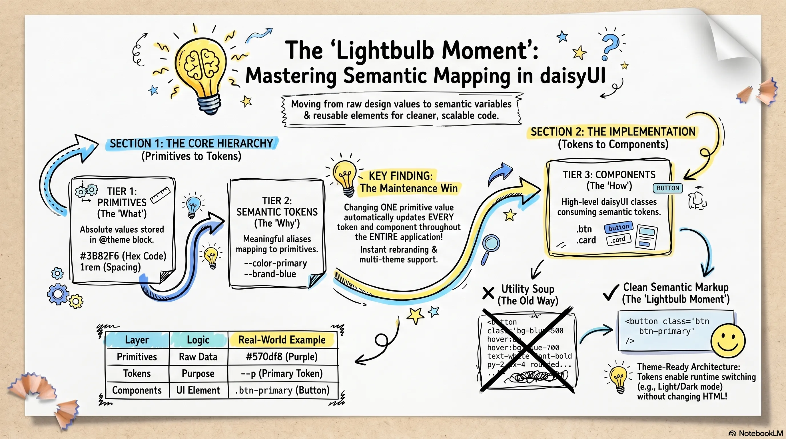
Speaking the Same Language: Semantic Mapping
One of the most powerful concepts in DaisyUI v5 is Semantic Mapping. Instead of styling a button as “Purple-600,” you style it as “Primary.”
The Shift to Semantic Class Names
By moving to content-agnostic utility classes, you treat CSS as a set of independent building blocks. This methodology prevents premature abstraction—the trap of naming things “ProfileButton” before you know if that button will be used elsewhere.
Instead of writing a complex chain of 12 Tailwind utilities every time you need a button, you use a semantic class like .btn. This makes your HTML significantly more readable:
- Before:
<button class="inline-flex items-center px-4 py-2 bg-purple-600 text-white rounded-lg hover:bg-purple-700 transition-all font-bold"\> - After:
<button class="btn btn-primary"\>
This abstraction layer ensures you stay within your design system’s guardrails. If you decide to change your brand color later, you update one variable in your @theme block, and every .btn-primary on your site updates instantly.
Organizing Your UI: Components vs. Utilities
As a solo builder, you’ll eventually ask: “When should I make a custom CSS class versus a React/Vue component?” The answer lies in the distinction between State and Style.
Framework Components: The “Smart” Layer
Use framework components (React, Vue, Svelte) when you need to manage logic, accessibility, or state. These are the “smart” containers for your application.
- Complex Patterns: A Data Table with sorting, a Modal with keyboard traps, or a multi-step Form.
- Prop-Driven UI: Components that need to change significantly based on data, like a UserAvatar that shows either an image or initials.
- Compound Components: When several elements work together, like a Dropdown where the menu must position itself relative to the trigger.
Atomic Utility Classes: The “Visual” Layer
For “Atomic” elements that are purely visual, don’t over-engineer. Follow the DaisyUI pattern by creating your own semantic utilities. This keeps your HTML clean without the overhead of a JS file for every small variant.
Custom Buttons & Badges
If your brand has a specific “Call to Action” button that goes beyond the standard .btn-primary, define it once as a utility:
@utility btn-cta {
  @apply btn btn-primary px-8 shadow-indigo-500/50 shadow-lg uppercase tracking-widest hover:scale-105 active:scale-95;
}

@utility badge-status-glow {
  @apply badge badge-sm border-0 animate-pulse bg-success/20 text-success font-bold;
}
Branded Cards
Cards are the workhorse of modern UI. DaisyUI provides the .card base, but you can encapsulate your specific layout logic into a custom variant:
@utility card-feature {
  @apply card bg-base-200 border border-base-300 transition-all duration-300;
  @apply hover:border-primary/50 hover:bg-base-100 hover:shadow-2xl;

  & .card-body {
    @apply p-8 items-center text-center;
  }
}
By using these utilities, your HTML remains declarative: <div class="card-feature"\>...</div>. You get the benefits of Tailwind’s speed with the maintainability of a CSS-native design system.
Adapting to the Dark: Native Theme Switching
With DaisyUI and Tailwind v4, dark mode is baked into the core. You don’t need complex logic to swap backgrounds; you simply define a dark variant of your theme.
@plugin "Daisyui/theme" {
  name: "my-dark-theme";
  base-theme: "night";
  --color-primary: #a855f7; /* A brighter purple for better dark-mode contrast */
  --color-primary-content: #ffffff;
  --color-base-100: #0f172a;
}
You can then trigger this theme globally using a simple HTML attribute: <html data-theme="my-dark-theme"\>. Because we used semantic names like base-100 for our backgrounds, your entire app will adapt to the new color palette automatically.
Keeping a Source of Truth: The Design.md Pattern
As your project grows, you need a place to track your design decisions. This is where the Design.md pattern becomes invaluable. Popularized in high-velocity engineering cultures, this is essentially “Documentation as Code.”
Instead of a heavy design tool that gets out of sync with your code, you maintain a Design.md file in your repository. Use it to document:
- The Palette: Why we chose specific brand colors.
- Typography Rules: When to use certain headings.
- Component Gallery: Links to your
/design-systempage where you can see your customized.btnand.card-productutilities in action.
This ensures that six months from now, you (or a future collaborator) will understand the “why” behind your styles. I will explore this new pattern in another article.
Operational Excellence: Best Practices for Builders
To keep your design system from rotting into technical debt, follow these established patterns:
Use the Visual Theme Editor: The DaisyUI Theme Generator is your best friend. Use it to visualize contrast ratios and accessibility before copying the final values into your CSS.
The “Kitchen Sink” Page: Always create a
/design-systemor/componentsroute in your app. Render every custom utility and DaisyUI component you use on this one page. This ensures that when you tweak a variable, you can instantly see the “ripple effect” across your entire site.Stay Semantic: Never use
bg-[#6C3B9F]. Always usebg-primary. If your brand color changes, you update one variable, not a thousand files.Content-Agnostic Naming: Name your custom utilities based on their visual role (e.g.,
.card-feature) rather than their current location (e.g.,.homepage-top-card). This allows you to reuse the logic anywhere without it feeling out of place.
Implementing the Blueprint: A Complete app.css
To tie everything together, here is a production-ready app.css. It follows a clean three-tier architecture: Primitives (raw colors) → Tokens (functional mapping) → Components (DaisyUI and custom overrides).
/* 1. CORE SETUP: Typography and Engine */
@import url("[https://fonts.googleapis.com/css2?family=Inter:[email protected]&display=swap](https://fonts.googleapis.com/css2?family=Inter:[email protected]&display=swap)");
@import "tailwindcss";

/* 2. PLUGINS: Standard components and typography */
@plugin "Daisyui";
@plugin "@tailwindcss/typography";

/* 3. DESIGN SYSTEM TOKENS: The Settings Panel */
@theme {
    /* Tier 1: Brand Primitives */
    --color-brand-purple: #6C3B9F;

    /* Tier 2: Functional Mapping */
    --color-primary: var(--color-brand-purple);
    --font-sans: "Inter", sans-serif;

    /* Global DaisyUI tweaks */
    --card-p: 0.5rem;
}

/* 4. FRAMEWORK MAPPING: Customizing DaisyUI */
@plugin "Daisyui/theme" {
    name: "light";
    default: true;
    --color-base-100: oklch(98% 0 0);
    --color-primary: var(--color-brand-purple);
    --color-primary-content: #ffffff;

    /* Global design language: rounded corners */
    --radius-box: 0.5rem;
}

/* 5. CUSTOM UTILITIES: Cleaning up the HTML */
@utility content-container {
    @apply container mx-auto max-w-4xl px-4 lg:py-10;
}

@utility nav-link-active {
    @apply text-primary underline font-bold;
}

/* 6. BASE STYLES: Standardizing typography */
@layer base {
    body {
        @apply font-sans text-base-content bg-base-100 antialiased;
    }
    h1 { @apply text-3xl font-bold mb-4; }
    h2 { @apply text-2xl font-semibold mb-2; }
}

/* 7. COMPONENT OVERRIDES: Fixing third-party styles */
@layer components {
    /* Ensure nav dropdowns reflect the active state of their children */
    details:has(ul a.active) > summary {
        @apply text-primary font-bold;
    }
}